Reimagining a winter pop-up
The Challenge
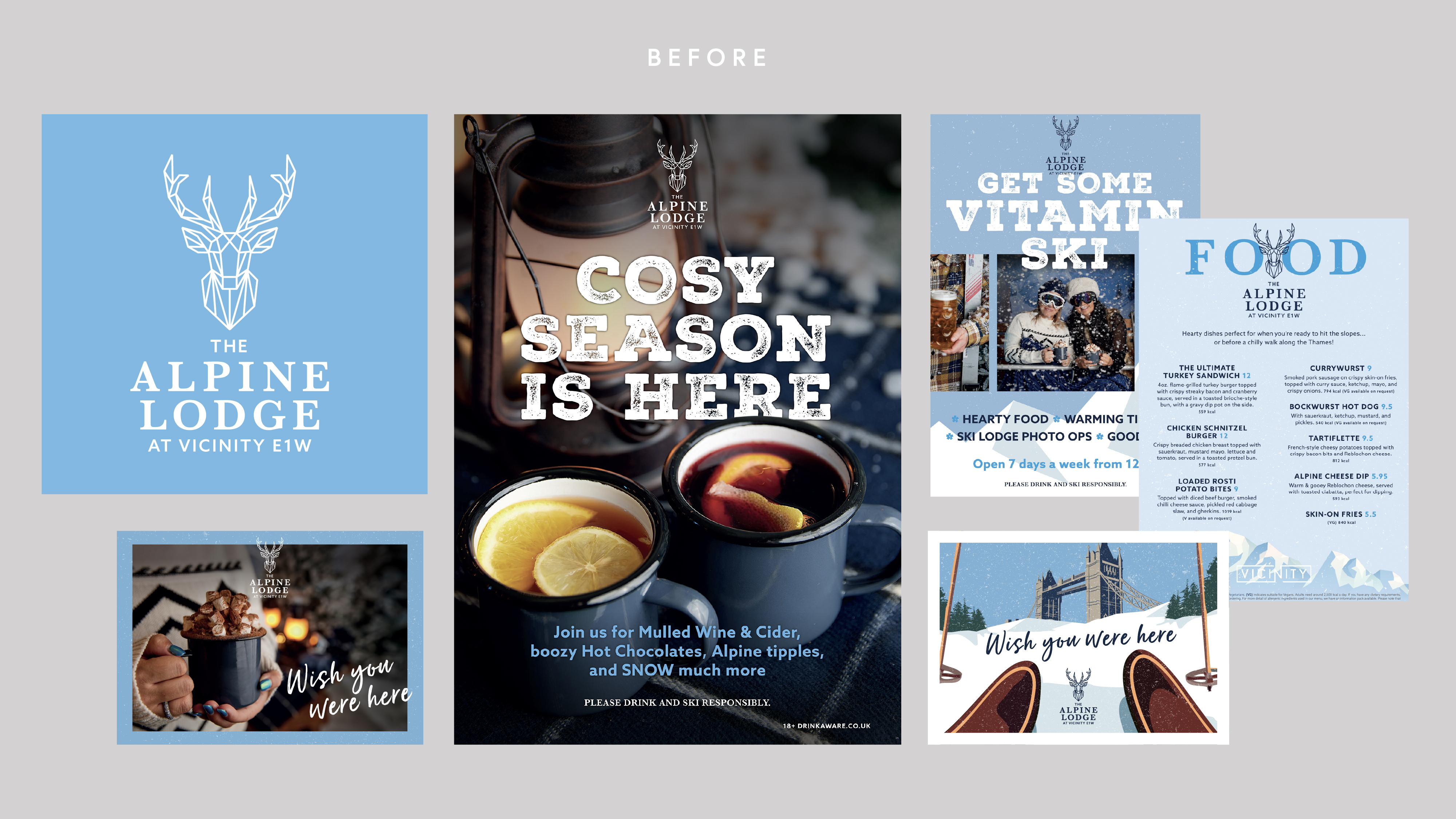
The Alpine Lodge needed a refreshed visual identity that could elevate a seasonal pop-up concept into something distinctive and contemporary without losing its connection to the parent Vicinity brand. The team had to develop a system that felt modern yet capable of expressing both the warmth of an alpine lodge and the crispness of winter. Achieving this required a strong visual anchor and a design system that could scale seamlessly across print, digital and environmental applications.
Key Issues
- Creating a distinctive seasonal identity that still maintained visual and structural harmony with the Vicinity brand and previous design.
- Developing a cohesive design system that could function across multiple formats.
- Identity
- Menus
- Advertising
- Digital Screens
- Social Assets
Our Approach
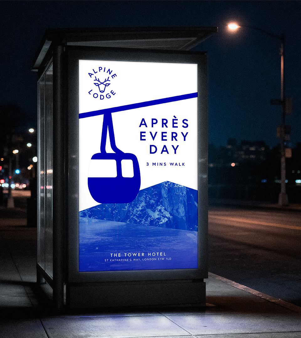
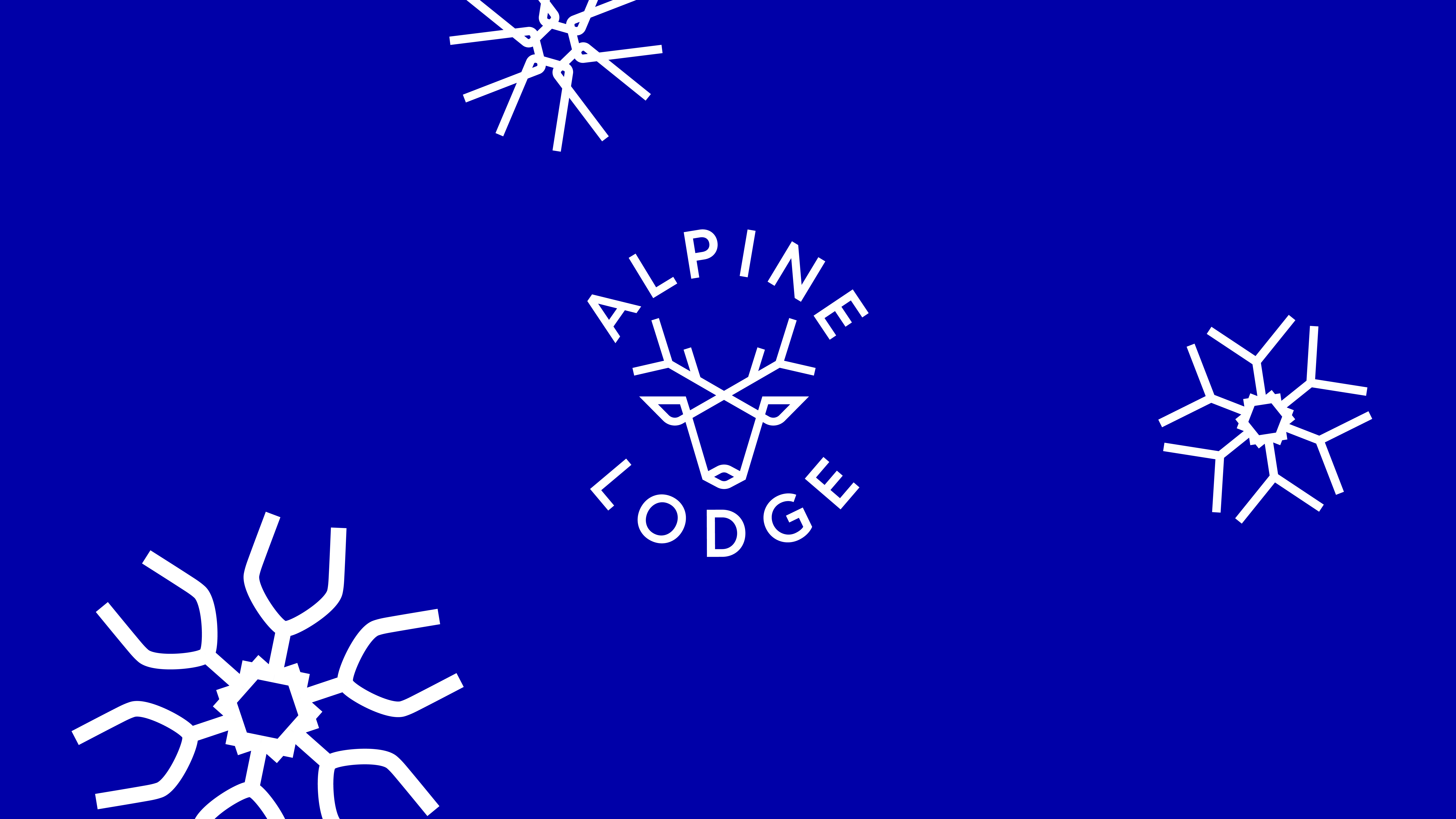
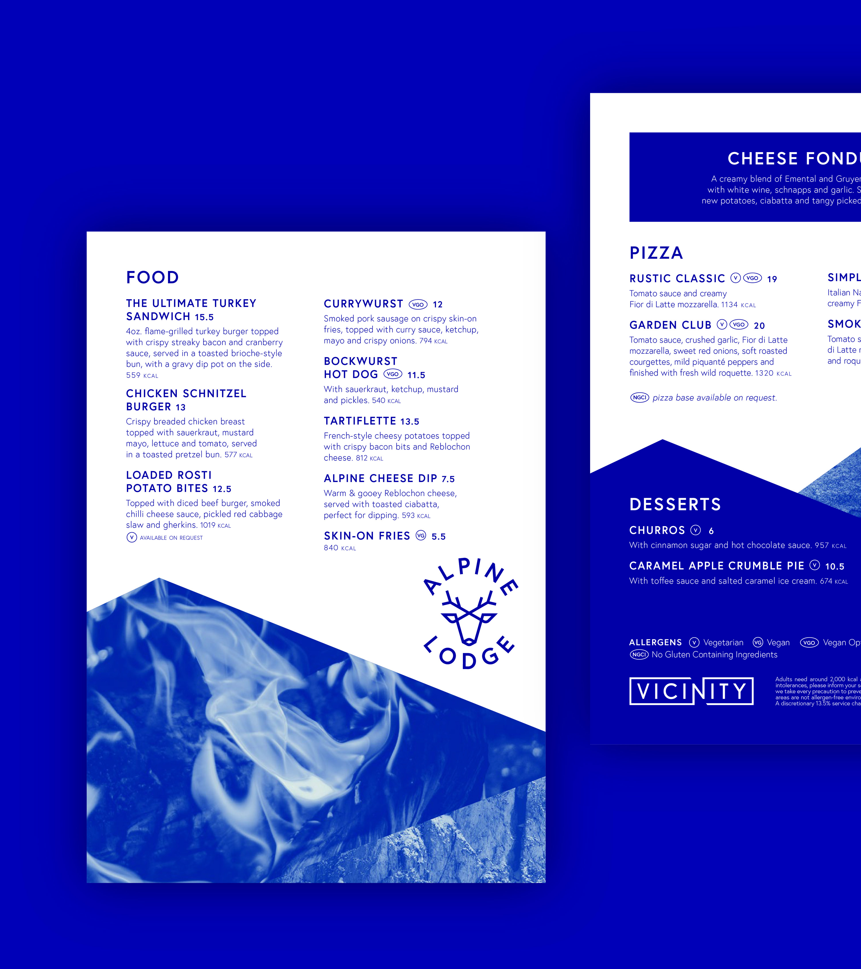
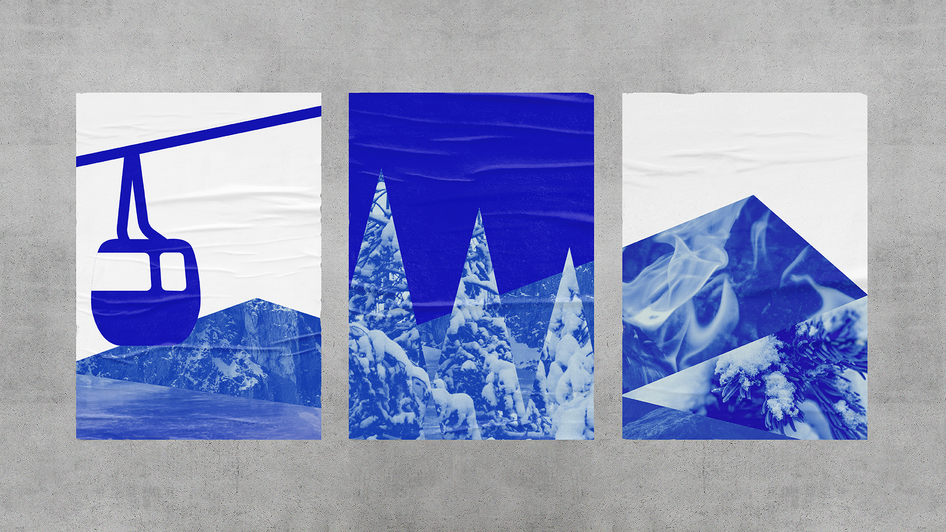
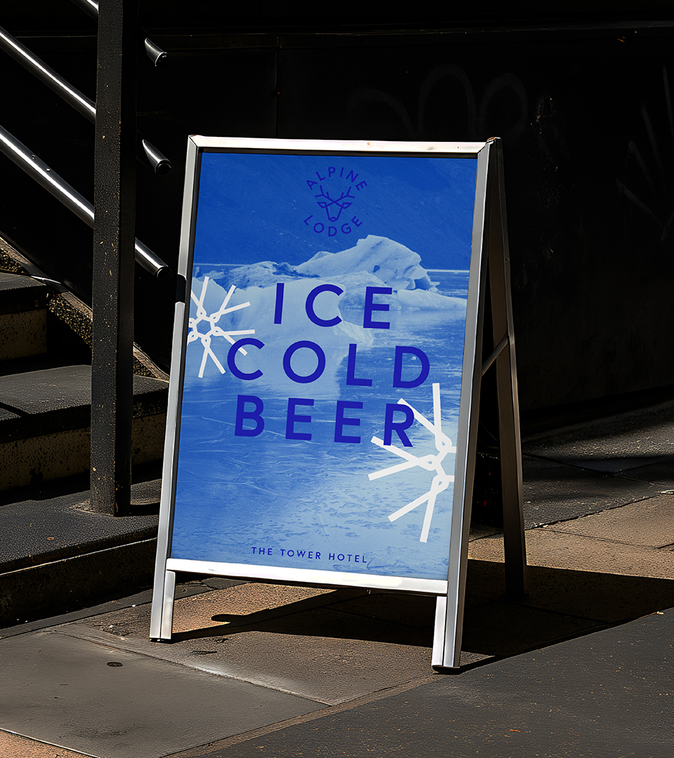
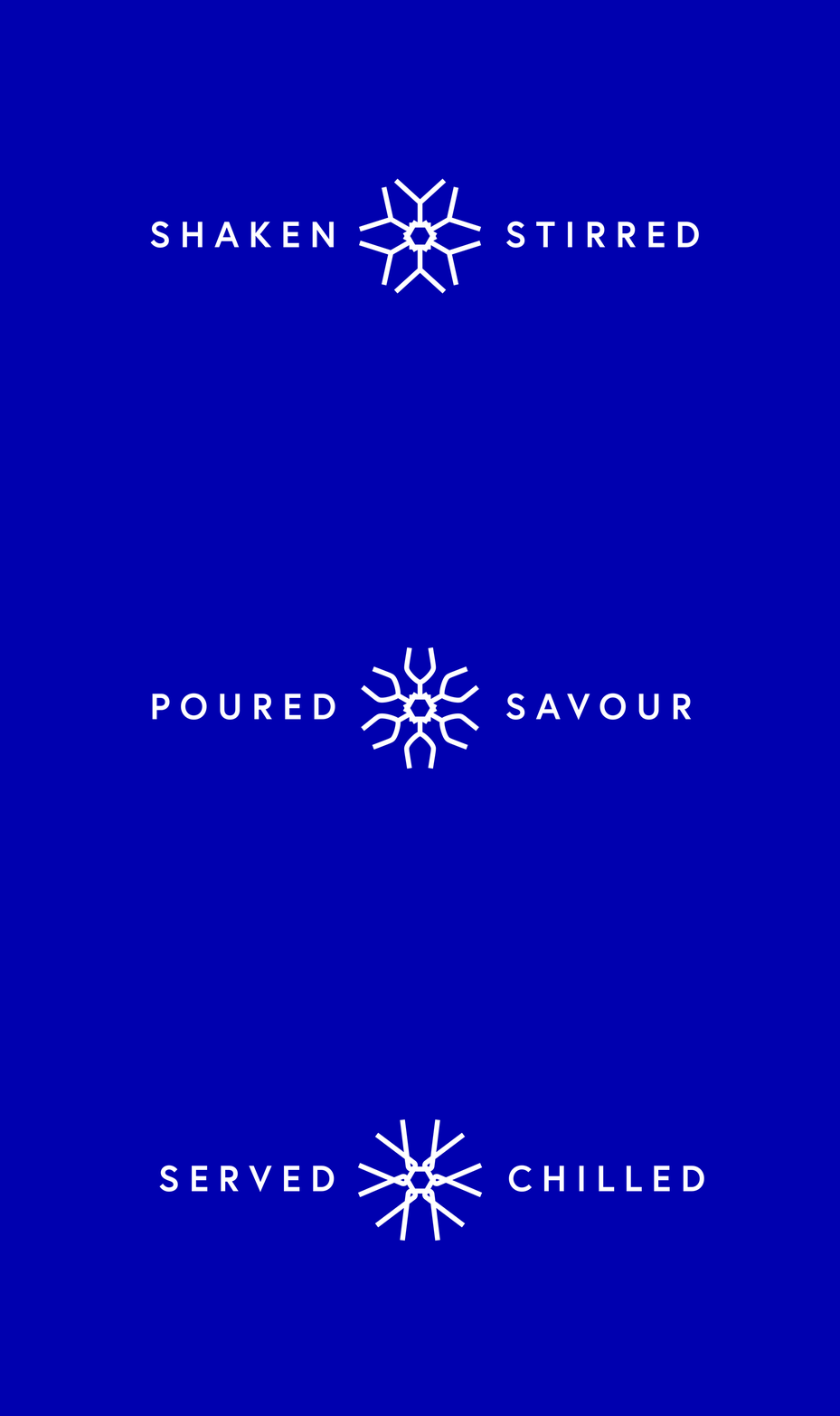
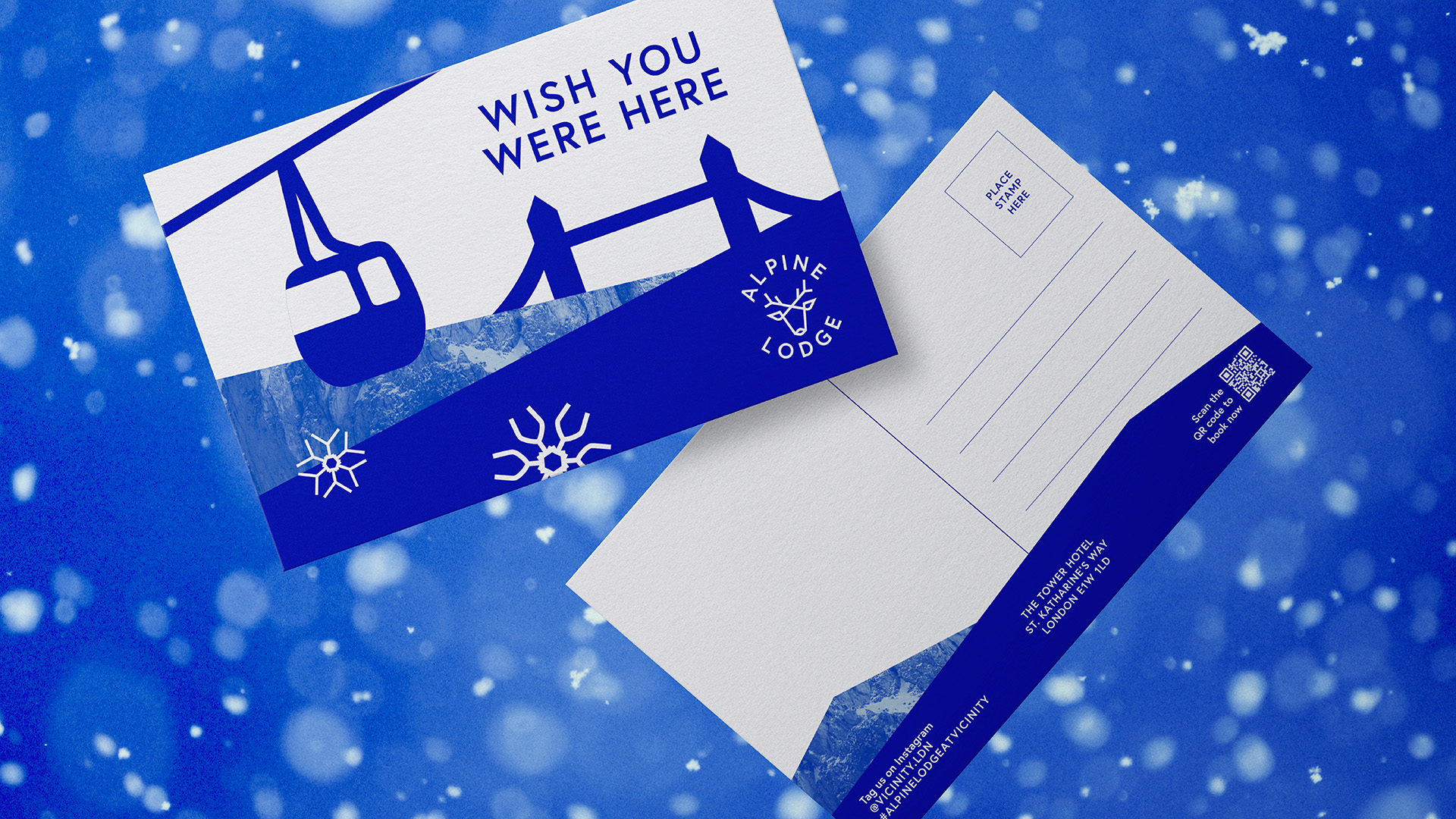
We anchored the entire identity in a bright, cool electric-blue palette, establishing an immediate and memorable visual signature. The original stag logo was retained but reimagined as a simplified, sharper icon, creating a versatile mark that could adapt across all media. This became the foundation for a wider iconography system, designed with matching line weights to maintain rhythm and cohesion. These icons were then expanded into snowflake patterns for menus, posters and larger brand moments.
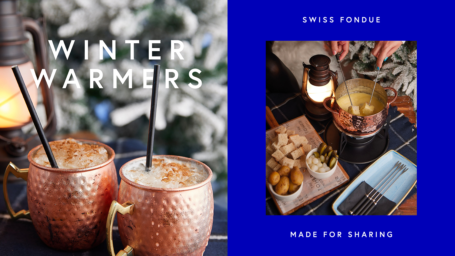
To add depth, we paired flat, clean illustrations with carefully selected photography of icy landscapes and snow textures. By juxtaposing these cool visuals with fiery, glowing imagery, the brand gained a striking duality and evokes both alpine warmth and crisp winter vibrancy. Throughout, we adhered to the parent brand’s line weights and typeface system, ensuring that the Alpine Lodge felt like a fresh extension rather than a departure. Even experiential elements, such as the ski-lift photo moment, reinforced the brand’s playful, modern identity.
Revenue has risen by 57% compared to last year, reflecting a substantial boost in overall performance.
The Result
The outcome is a vibrant, contemporary reinterpretation of an alpine lodge and one that feels fresh and unmistakably seasonal. The disciplined use of electric blue ties every asset together, from advertising to signage, helping the venue stand apart from traditional lodge imagery while maintaining recognisable links to Vicinity’s brand DNA. The refined logo, modular icon set and layered visual textures create an identity that is both expressive and strategically aligned. What emerged is not just a winter pop-up, but a fully realised visual identity that resonates with both new and returning visitors.
Key Outcomes
- A cohesive single-colour system that unifies all communications and delivers instant recognition through a vibrant electric-blue palette.
- A modernised brand toolkit, including a simplified stag icon and a scalable set of graphics.
- Clear synergy with the Vicinity parent brand, achieved through consistent line weights, typography, and a shared visual structure across all assets.
